Coding an Entire WORLD

Websites, everyone’s got one, and we’re all familiar with the concept. But just how important is a new website? What are the new web trends of today, and why should my site utilize them?

We have a top-notch web developer on our team named Yuriy. We asked him what his favorite thing about his job was, and he said, “I think my favorite part is how you can make visual changes using code. You basically build an entire world. To me, that seems so powerful and beautiful at the same time. I love programming!”

With all the popular web trends to date, there are three in particular we’d like to highlight.

Parallax Sites:
The word “Parallax” comes from the animation world. It’s the name of the effect where background elements “move” in relation to the viewer. Think of driving along a hill and looking out the window. You’ll notice how things move at a different pace. Closer things zip by, where farther things seem to barely move. In the animation world, this creates an illusion of 3d space, and websites can have it too! It looks amazing, and it’s fun to navigate!

Responsive Sites:
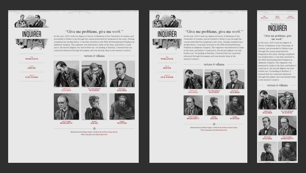
Waaaay back in the olden times, there were things called “Desktop Sites” and “Mobile Sites”, which operated closely together, but still so very apart. “Ye olde two sites” is what I believe they called them. But these days, Responsive Sites do the job of both Desktop and Mobile. They’re sites that resize depending on the size of the browser it’s view upon—automatically! Essentially, you make one site that’s viewable from any platform you visit it from!

Improved Search Engine Marketing:
We have an SEO specialist, who acts as a ninja, implementing your site everywhere without a trace! You’ll show up higher in google searches, and will therefore be easier to find! His name is Joel. Call us today and see what he can do to make you appear in web searches!

Get a hold of us at MOS Creative, and we’ll help YOU stand OUT!


-The MOS Creative team

Throwback Thursday: North Point Builders!

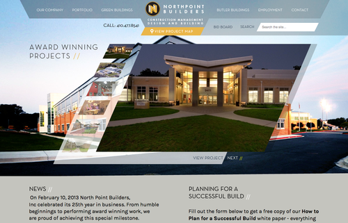
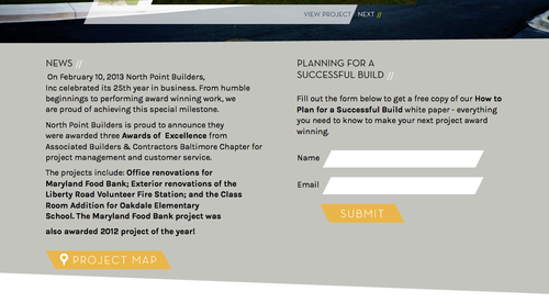
Hello everyone! This Throwback Thursday, we want to show you a site we’ve created for North Point Builders.

We’ve come up with a slanted theme that’s prevalent throughout each page of the site.

Every aspect falls into this style.

Not only were we focused on keeping the same feel, but we also had fun with it. The navigation bar shows this.

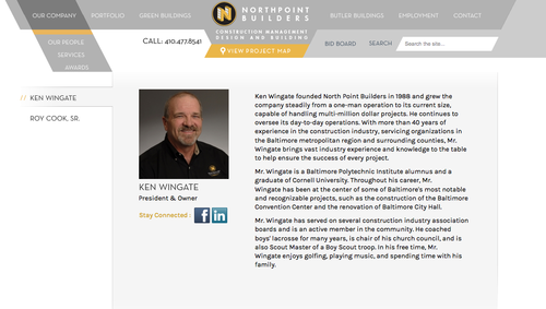
Even the dropdown menus followed this slanted style

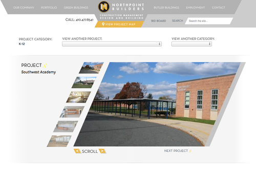
Notice how the Portfolio page keeps this up

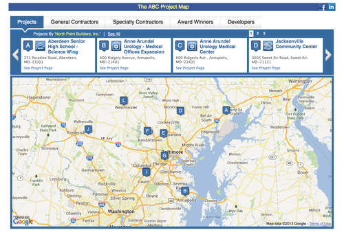
We even implemented a map to show locations that this company has done work.

Like what you see? We here at MOS Creative can create an awesome site for you too. Ya’know, just ask!

-The MOS Creative Team

PS: check out our Tumblr!

Modern Web Design: Some of our favorites.

Web Design is always changing, and what may have been a trendy and engaging site five years ago could be old news. We see this all the time with clients who may have done something very trendy, but now their traffic is down and their bounce rates are up.

Fair or not, a lot of visitors will judge you based on your site’s design, great content or not.

Here are a couple of moderately future proof design ideas that we love, and that your visitors will be impressed enough to stick around for or even share.

Progressive Loading:

This style of website’s goal is simplicity and focus. As a visitor scrolls through the website everything loads up on the same page in a dynamic progression of content. In a marketplace where everyone has short attention spans, it’s not always wise to expect someone to click through 4 pages of your site to read your whole story before doing a sign up form. This method keeps people focused and tells the story your way and naturally flows into your call to action.

Click here for some great single page designs.

Click here for some great single page designs.

Textured Background:

Textured backgrounds are great as a way to add some reality to website, you can make your site seem like something tangible, something more than pixels on a screen. One thing to be aware of is overdoing it though, as too much can be distracting and reduce the focus on your site.

Textured Backgrounds

Typography:

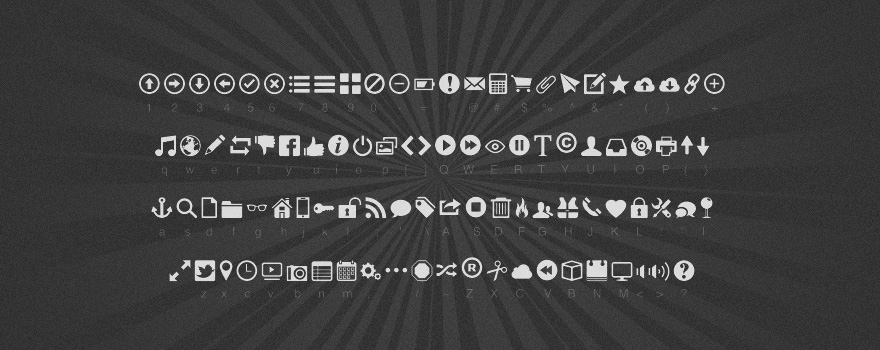
For a while there was a trend with sites using safe fonts. You were never quite sure if it would cause issues on your site to use a more interesting font. These days however, it’s gotten much easier and safer to spice things up on your site because there are a lot of new apps and protections to make sure that the site will operate as intended. This has led to a resurgence in interesting, branded fonts on sites.

Sorry! No link this time!

Sorry! No link this time!

High Res Web:

These days everyone is using high res devices, but, those high res devices can be any number of sizes or dimensions. Users are sensitive to resolution and “crispness” of images like never before. This means for designers that making use of all the modern tools is a must to display crisp graphics in a responsive way.

Click for a great blog on the subject.

Click for a great blog on the subject.

Using Pastels:

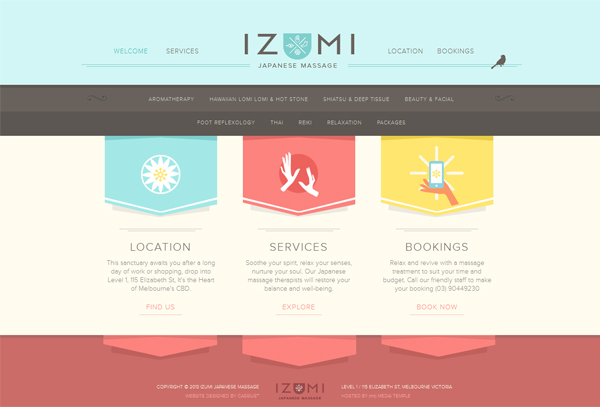
This follows the current trend of simplifying websites and going for minimalism. The pastel color pallet makes sites seem more simple and friendly. Another benefit is it adds more contrast to the site and gives your visitors happy feelings.

Click for 50 great sites that use Pastel.

Click for 50 great sites that use Pastel.

Infographics and Social Media:

The most important thing to note about this ongoing trend is its shareability. People love sharing information but with the oversaturation of information people are much less likely to read a couple of pages on a subject. Because of this, we need to give them bite sized and friendly doses of information if we want people to engage.

Infographic


Thank you for reading! We hope that this helped spark some ideas for your new website or your next website update.

You can leave a comment or question below and we will make sure to get back to you!

Check us out at MOSCreative.com.

Best,

JT

Why I Actually Loved My Summer Internship

Last week, I asked Tony, our animator, if I could “get him coffee or anything” because he looked tired. When he refused, I stood on my chair and yelled:

“Hello? I’m the intern here! I haven’t done any intern-ly tasks all Summer. Where are the papers I should be filing? Why don’t I know your coffee preferences by now!?”

Ok, so I didn’t really stand on my chair, but did I realize that I’ve been interning here for 3 months now, and never had that “internship experience” that my friends complained about. I was immediately treated like a team member, never called an intern, and honestly, I forgot that I wasn’t on staff. I jumped right into projects that went directly to clients, and was never given busy work. Continue reading

Responsive Web Design for Beginners

Responsive Web Design ExampleAs web technology continues to evolve, so does the platform that we interact with it on. Now-a-days, clients want their websites to be compatible with a variety of devices, including iPhones, iPads, Kindles, HD TVs, desktop computers – you name it. And in five years, who knows how many more of these gadgets will be out there?

When a person visits a website from any one of these devices, they expect it to be easy to navigate and formatted in a way that makes sense. If not, they probably won’t waste their time on it scrolling around and will find another option. Losing website viewers (and potential customers!) for a reason as simple as this is a HUGE mistake for web developers. Yet at the same time, designing an entirely new website to specifically fit each device would take up an impractically large amount of your time. Trust us, we know how precious time is in the web design industry!

Don’t worry, there is a solution to this problem, and it’s called responsive web design. Responsive web design is the concept that a website’s design should adapt to fit the size and shape of the screen that it’s being viewed from. For example, when a person switches from viewing a site on their laptop to their iPhone, the site will automatically recognize this change in device and respond to the new preferences.

Continue reading

5 Mobile Fails You Should Learn From

As smartphone sales continue to grow like crazy, especially as we enter the jolly holiday season, it’s no surprise that mobile is the new dot.com bubble. And many companies are paving highly effective ways to engage. Actually we’re all just now figuring it out and grasping the question – how do consumers interact with their mobile devices, what roles do they play in their lives, and how can we tap into that?

So as the learning curve goes, and marketing trial and error takes its course, there are bound to be some fails and missteps. Let’s take a look at five of the mobile fails we can all take a lesson from as we plan our strategies for 2012.

  1. The dying trend, check-in apps. Daily deal offering sites like Groupon and Living Social met the same fate earlier this year. It was enticing at first, and then consumers get bored with it. Oldest story in the book. Gowalla and Foursquare were cool a year ago, but as retailers started to catch on to the trend and created their own shopping apps with check-in incentives, the enthusiasm began to ween.
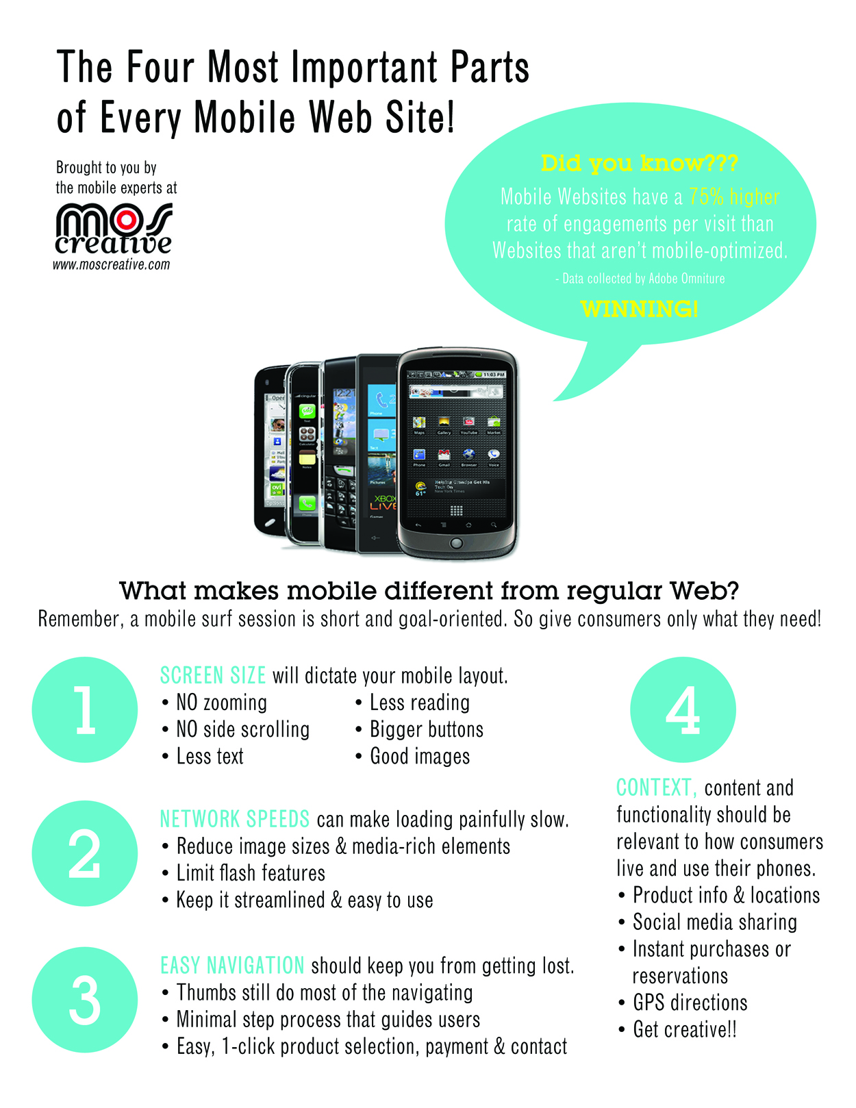
  2. Forgetting that mobile is a whole different animal. In case anyone out there still questions it, you CANNOT just take your web stuff and throw it on a mobile site. No no no. Mobile is a whole new opportunity to interact. There are benefits, challenges and strategies completely separate from your PC web tools. If you avoid the copy and paste trap in re-purposing the web, you can take advantage new capabilities, such as HTML5.
  3. If you’re doing mobile, do it right. A lot of you are experimenting with mobile tools, such as QR codes and social media, without creating a mobile-optimized destination for visitors. So just when you get them right where you want them, your mobile visitors land on your PC site. Ew! I can promise most of these visitors are not coming back. That’s a lot of lost conversions and sales.
  4. Agencies aren’t focusing on the big picture. Mobile web and mobile strategies can’t just be an afterthought in your bigger plan. But for this fail we blame your marketing agency. We can’t emphasize enough the significance of the mobile experience in the focus of your brand, and in driving further mobile growth. A lot of brands are still just missing the boat on this one.
  5. Manufacturers are still playing catch up. RIP feature phones. I can still remember the simple days, when my phone’s buzz alert could only mean a text message. Now it could be an email, Facebook message, tweet, status update, check-in or any of the thousands of other connections. It was a sudden and unexpectedly rapid death that manufacturers were not ready to capitalize on.

(Thanks to our friends at Mobile Marketer, see their original article.)

What it takes to be Steve Jobs

“Why join the navy when you can be a pirate?” Wiser words never uttered by a man more influential and responsible for single-handedly transforming the computing and mobile landscape.

Steve Jobs told us to be crazy. He told us he wanted to put a ding in the universe. He didn’t put a ding, but he sure left an Apple.

A single glance at the non-stop media coverage, and you’d think America’s greatest superhero finally befell to his kryptonite. #SteveJobs, #iSad and #ThankYouSteve rotate Twitter’s trending topics, and pictures of our generation’s Thomas Edison continue to flood Facebook’s news feeds.

But in no jest, he was a hero to millions, probably billions, of people he never met. He changed the way we think about and interact with the world. Every time you have to ask your kid a computer question, remember, he’s the reason.

Continue reading