The purpose of this blog is to provide an easy-to-understand and easy-to-use method of predicting conversions off of a chosen variable in an Adwords account.
Keep in mind – this is the simplest way, and therefore one of the less accurate. You’ll get a good estimate, but some more heavy lifting is needed to factor in the huge number of variables the average account has.
So, first thing first. Go to your Adwords account and export a report of weekly data for whatever ad group or campaign you’d like to predict. The more data you have the better (make sure to highlight the whole spreadsheet once it’s in excel, including headers, and select to format it as a table). Once you do this, you will have a spreadsheet that looks something like this:
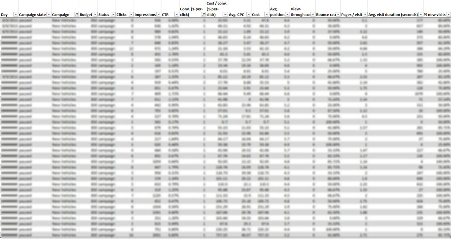
(data has been blurred because of confidential client info)
Now, from this spreadsheet go to the headers – they’ll be the top row, and select the arrow next to the filter that says “Clicks”.
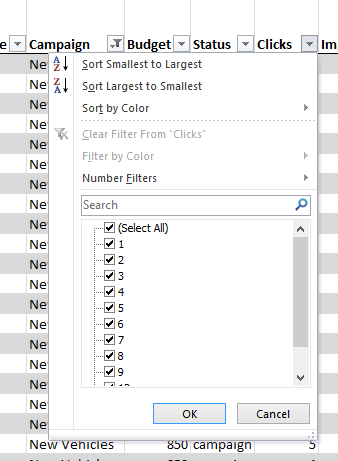
Once you reach this menu, click “Sort Smallest to Largest” at the top. This will sort all of the data according to number of clicks.
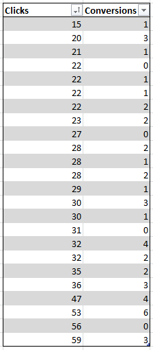
You will end up with a selection of data that looks something like this:
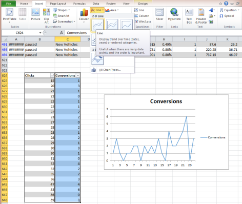
Once you have your variable and conversions data sorted properly, go ahead and make a line chart out of the conversion data. Just highlight the conversions data column, and click to insert Line Graph on the top right. Now you have a graph of conversions sorted by the number of clicks.
There are still a few more formatting things to be taken care of before we get to the predictive model.
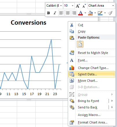
Right click your graph and hit select data:
Once you get to the Select Data Source window, click Edit below the “Horizontal (Category) Axis Labels” title. From here, select your click data, which should already be sorted in ascending order like this:
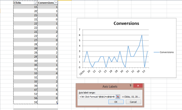
Congratulations! Your graph is ready.
The next step is to insert the linear or exponential equation. To do this, right click on the line in your new graph and select “Add Trendline…”. You’ll see a window like this:
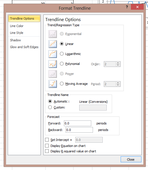
Select either Linear or Logarithmic, and select the “Display Equation” and “Display R-squared” boxes. Your window should look like this when you are finished:
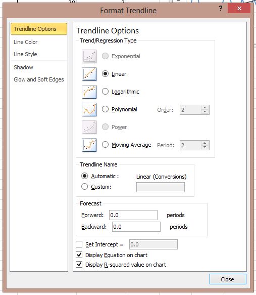
Okay! You now have your equation. Your graph will look like this now:
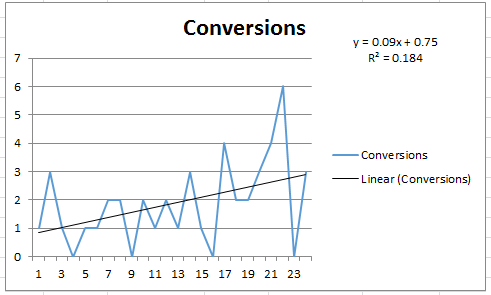
The Y= equation in the top right is your new predictive model. Simply plug how many conversions you want into the Y position, and solve for X. This will get you however many of X you need (within a range, of course) and help you plan your budgets alongside your goals.
The R2 value below the equation is a measure of the accuracy of the equation, see the Wiki. The higher this is the better. You see a lower R2 here because we’re only taking one variable into account.
Next, I’ll show you how to make it a simple tool in your spreadsheet so that you don’t have to solve the equation by hand every time you want to predict something.
There may be an easier way to get excel to solve your equation, but here’s how I do it. To restructure your equation, basically use your algebra skills to switch it around so X is on the left side. Mine looks like this:
Original: y=0.09x=0.75
Modified: x= (y-0.75)/0.09
Once you have that, you can make a table in excel where you can easily change your desired conversions and get an estimate on your variable.
Make a 2×2 table, one column is Conversions, the other is your variable (for me it’s Clicks). In the variable column, put in your modified equation, with Y being the cell under conversions. For the spreadsheet I’m using in this example, the cell under “Required Clicks” is “=(F645-0.75)/0.09”.
The results look like this:
![]()
– Joel (MOS Online Marketing Specialist)